If you haven’t already seen it all over the internet, the Washington Wizards have a new look, thanks to owner, Ted Leonsis. I’ve been hearing for a long time now that Mr. Leonsis has been trying to get a more unified color scheme for all of the Washington D.C. sports teams. With the success of the Capitals’ new red logo, he took the Wizards in the same direction. Leonsis was in charge of re-branding his newly acquired basketball team to update the older, retro colors and logo of the Bullets. No, they weren’t going to change the name back to the violent ‘Bullets,’ but everything else would resemble the old team.
The first thing to change was the logo. The direction was taken from the Bullets’ old logo where the name is spelled out, and the two letter ‘l’s’ became long arms reaching out to a basketball. This old logo, combined with the Wizards’ most recent “DC” type logo made of lower case letters were combined to create this new logo:
 As you can see, we are back to the creative use of letter ascenders creating the image of arms playing basketball. Honestly, I think this is kind of a cop-out way to bring the basketball imagery into a type-based logo, but it works, and is reminiscent of the retro Bullets logo we had so embraced. From this new logo (taken from the Wizards’ website) we can also deduce a few more things about the Wizards’ re-branding. We now see the return of the “American” colors of red, white, and navy. (The same colors the Capitals used in re-branding their organization.) We are also introduced to a new typeface:

Like the Caps did with their new logo, the Wizards have updated the old font in the Bullets’ logo, and modernized it for today. The new typeface, a stylized and adapted version of the lettering seen in the old Bullets’ look, can also be seen on the Wizards’ new uniforms:

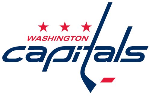
As you can see, the new jerseys have been modeled after the Bullets’ jerseys and colors. White is for home games, and Red is used for away games. The typeface is used here in an all-lowercase version. I actually really like the look of the new numbers in this font, and like with the playing of letters to create images (used for the Caps’ logo creating a hockey stick out of the letter ‘t’), we see the lowercase ‘h’ in ‘washington’ become the Washington Monument. We are also introduced to the dot of the lowercase ‘i’ becoming a basketball. You can watch the press video that outlines more clever details added to the new uniforms: here. (I recommend it!) Also, if you take a look back at uniform history in Washington’s basketball franchises, you can see that the horizontal stripe across the chest (which I am actually not a fan of) harks back to older jerseys. (Check out that video here.)
I think this is all a clever move for Ted Leonsis and D.C.’s sports teams. Now, the color red can be seen throughout all of the city’s major league teams: The Nationals, The Mystics, The Capitals, D.C. United, The Freedom, The Kastles, and even The Redskins (because burgundy is still in the red family and I’m pretty sure their colors will never be changed). While I think the new uniforms look a little clown-like and campy (seriously, if they just took away that horizontal stripe, I’d like the new look a lot more!), I think it is a neat idea to have all of the sports teams sharing the same color. Obviously, Mr. Leonsis took this cue from rival sports town, Pittsburgh, whose black and gold colors can be seen on the Steelers, Penguins, and Pirates. I suppose a unifying color scheme can bring a city closer to its players and fans. I also hear that the Wizards performed their best when they last wore these colors (as the Bullets), so maybe this whole color thing, can bring back some real basketball winners to this city!


